This case study is on Betterplace B2B app that offers 'work-time' tracking for blue collar employees.. ✳️ 👉🏼 Attendance correction/ regularisation is a functionality that enables these employees to request correction in already collected work records by the employer in a given period.
User's in-app plus at workplace touch points were audited and redesigned this module for improved data accuracy and user experience.

Challenge
▪️ Attendance corrections had ~42% manual errors.
▪️ Steady decline in customer retention due to data inaccuracy. — causing delayed wages for employees and resource inefficiencies for employers.
▪️ High operational costs due to frequent on-site training due to high turnover among contract/ gig workers.
▪️ Content structure lacked logic.
Constraints
▪️ Limited time for end-to-end solution.
▪️ Blue collar vendor management & workflow differences at workplaces run by large enterprises like Intel, Cisco, Reliance etc.
▪️ Planning an onboarding training for new user flows within the period.
▪️ Design files were missing several user flows and in-between screens. 😶
Who are the users
Primary qualitative research was done among the following users in the field in workplaces in Bengaluru.

Overall workflow
The whole project took 3 months from inception to release. This chart contains all the steps which were instrumental to the problems that were being solved in the redesign.

Initial approach
After gathering stakeholder information, I began my process by auditing the user flows to create a strong sense of perceived progress, find structure among the chaos, and pinpoint the issues.
Key points to solve
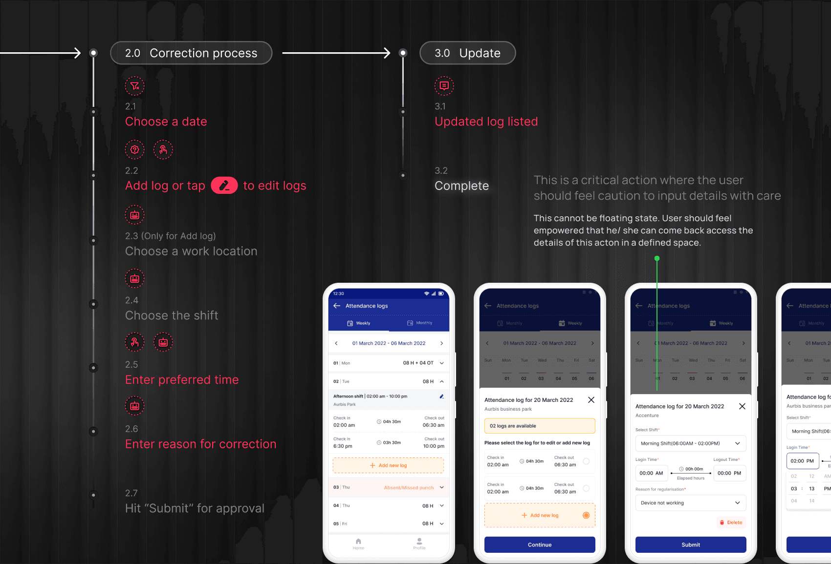
▪️ Eliminate causes of errors by removing clutter and avoiding closely grouped actions.
▪️ Restructure content display order
▪️ Deliver proactive feedback for every action and status
▪️ Break forms into intuitive and contextual mini-steps
Ideas
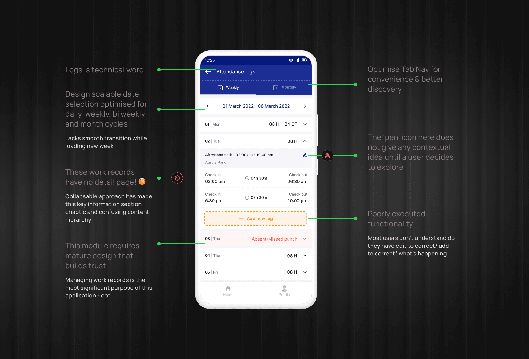
▪️ Logs? That's more of a technical word - History, records, and register are more familiar irrespective of industry.
▪️ Monthly view is more scannable and gets the user's attention to specific dates that require action
▪️ State the reason and then change or add details. Yes, that's how people think.
Research
Since we had less time to pitch solutions to our vendors, I conducted a few interviews and relied more on recorded sessions and secondary data available on critical 500 workplaces.

Insights
▪️ About 42% of correction requests had errors, such as adding new logs instead of correcting existing ones, deleting the correct log, or missing multiple entries.
▪️ Users preferred getting notifications for each activity.
▪️ 98% of processes were recorded manually, bypassing digital proof.
▪️ Users preferred to have an interactive calendar page with details rather than two tabs with incomplete information.
Verbatim: "Sir, I only check the app calendar to clear attendance with my manager."
Solution
After critically validating the design interventions using wireframes and prototypes, stakeholder feedback, and research insights, here are a few screens from the redesign. For visual design, I stuck to the existing design language.

Happy flow - Edit
Video - looped, avoid hovering. UX copy change: 'Attendance logs' got changed to 'Attendance records'
Other improvements
▪️ Implemented a default limit to the number of regularisation requests that can be raised per month. Admins can configure this value on the portal.
▪️ Mobile experience for supervisors for timely response.
Key Screens
Home page ⟶ Attendance records ⟶ Solutioning
Explorations
Impact & reflection


