How do you design a seamless, meaningful time-tracking experience for a fast-paced work management startup impacting a million frontline workers? In this project for Asia’s largest human capital platform, I delivered a user-centric solution that streamlined workforce management, balancing efficiency with intuitive design.
The project faced a significant team restructuring just as we were approaching the implementation phase, drastically shifting my capacity and responsibilities. Despite these challenges, I remained focused on delivering impactful results.

Project workflow
Project workflow spans from Q2 2023 to Q1 2024. The project has several phases and cannot be represented in a linear workflow chart. This document outlines all the essential steps involved in the redesign.

Problem
The existing attendance solution was unreliable, causing errors, rework, and frustration for employees, managers, and enterprises. Inaccurate reports disrupted payroll processing and left users without dependable proof of work, undermining confidence in the system.
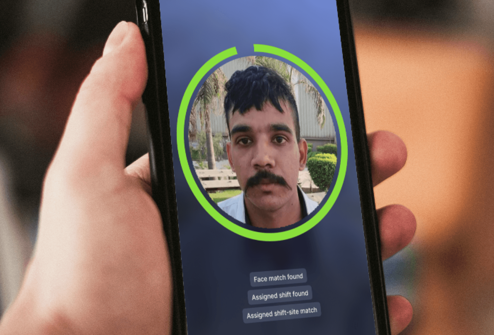
▪️ A cluttered screen with poorly structured content and CTA causing more than 85% of missed punches.
▪️ Poor attendance marking experience increasing the number of corrections requested and consuming 3-15 mins for check-in.
▪️ Lack of proactive feedback.
▪️ Ensure product readiness for expansion into new domains and geographies.
Constraints
▪️ New design language for Gobetter products.
▪️ Conducting primary qualitative research in workplaces outside Bangalore, especially manufacturing units.
▪️ Team restructuring that included the head of design — challenged ensuring effective use of design methodologies in the Product-led project.
▪️ Limited development resources due to a large enterprise onboarding.
Who are the users
Primary qualitative research was done among the following users in the field in workplaces in Bengaluru and arranged user recordings from facilities outside Bangalore city.

Initial approach
Insights from stakeholders
▪️ Regularisation came in handy as the ultimate remedy for attendance module-related issues (I wondered how a product succeeds if that's how problems are resolved 😶)
▪️ Attendance app users were dropping at a rate of 3% every month
▪️ 8+ workplaces in Bangalore
▪️ 150+ employee interactions
▪️ Use cases impacting 35k+ mobile app users across 500+ sites.
We used experience mapping to visualize and communicate users' end-to-end experiences in attendance tracking. This helped us identify pain points and focus our attention where needed.

Research
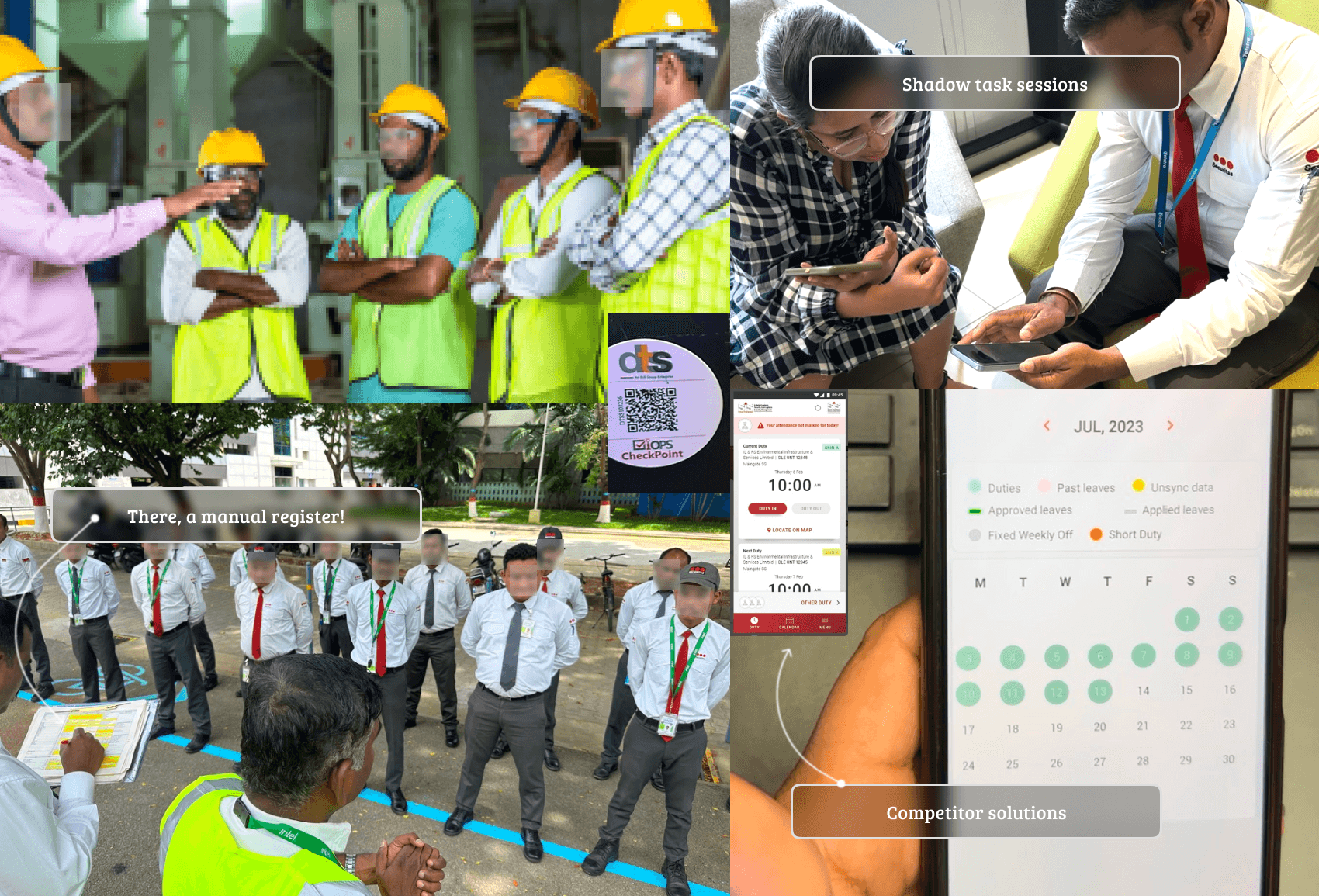
In the field, I advocated understanding the user's challenges by closely analysing user interaction with the app before, during and after the shift through real-time task analysis, shadow sessions, and one-on-one interviews. We collected a pervasive list of insights from the field and shared them with the key stakeholders.
Key insights relevant to this problem
System Errors & Missed Actions:
▪️ Frequent system errors (inaccurate data, geofencing issues, missed reminders) lead to user corrections and wasted time.
▪️ Users avoid self-exploration, fearing mistakes or consequences.
▪️ Some users fake task completion and blame the app for errors.
Validation & Accountability:
▪️ Users rely on regularisation and manager validation for accountability.
▪️ Users maintain screenshots for proof and accountability.
▪️ Hesitancy to seek help from peers due to fear of exposing weaknesses.
Key points to solve
▪️ Eliminate causes of errors by removing clutter and avoiding closely grouped actions.
▪️ Restructure content display order
▪️ Deliver proactive feedback for every action and status
▪️ Break forms into intuitive and contextual mini-steps

Ideas
▪️ Task-focused homepage
▪️ Reconfirmation step to prevent errors
▪️ Proactive feedback
▪️ Visibility ongoing shift
▪️ Comprehensive log list page
▪️ Evocative log detail page
▪️ Detailed edit state
Building stakeholder alignment
Shifting perception from 'easy to teach to easy to adopt'
From the start, leadership and stakeholders had strong biases about frontline workers, which influenced the development of the Betterplace attendance app, resulting in a poorly empathized product. We framed these biases as 'perceptions' and their impact as 'influences,' countering them with real-world observations. This shift helped redefine the solution, emphasizing a 'frontline-friendly design approach' over a 'perception-driven approach' focused on business needs.

Solution
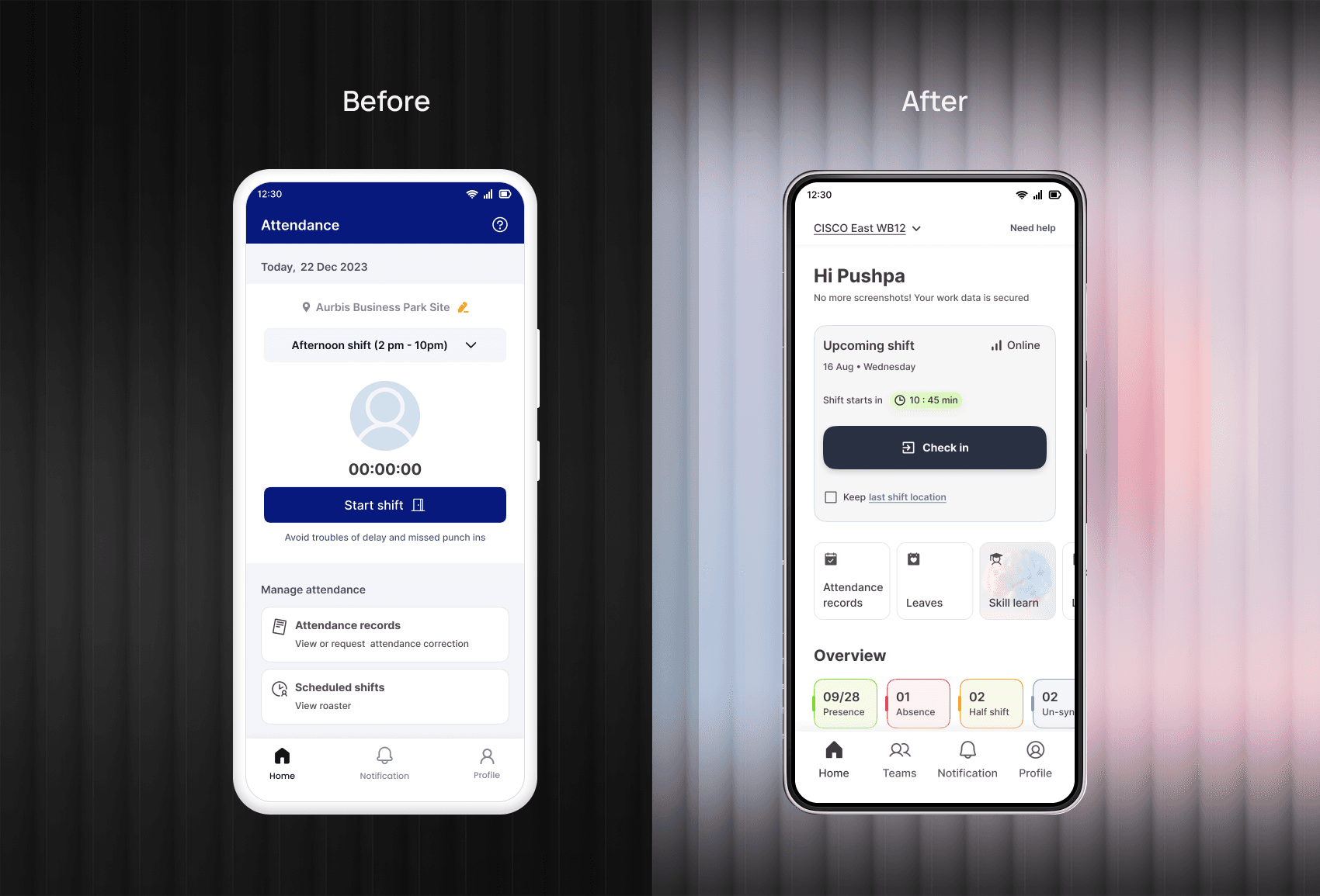
After critically validating the design interventions using wireframes and prototypes, stakeholder feedback, and research insights, here are a few screens from the redesign. For visual design, I stuck to the existing design language.
▪️ Focused homepage with shift details, map, and accessible sub-modules, balancing critical and dynamic modules for better user planning.
▪️ Confirmation page for shift verification, reducing errors before proceeding.
▪️ Feedback mechanisms (visuals and voice) boost confidence and reduce mistakes.
▪️ Post-start shift editing allows quick corrections without altering the original login time.
▪️ Clear log status and strategically positioned 'Regularise' CTA to prevent errors and unintentional clicks.
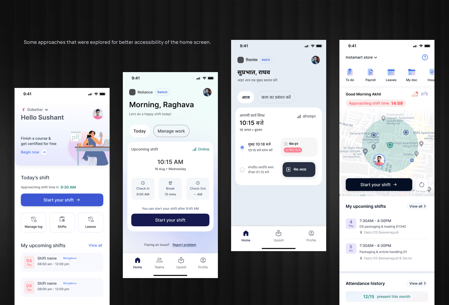
Design explorations
Approaches that were considered and explored determined the direction of the final designs. These prototypes were utilised to validate the feasibility of the solution with the stakeholders, end users, and engineers.
Evolution of design decisions made
The team invested time in defining the homepage anatomy, as it is the user's main entry point. We considered various contexts and use cases to ensure it serve its purpose effectively.
While UX designers typically aim to minimize friction, I was certain that adding deliberate friction to this flow would significantly enhance the solution's success. I actively advocated for exploring various options to incorporate this friction into the attendance marking journey, while ensuring that no technical glitches would disrupt functionality or cause issues for users.
Using a PWA, our initial approach was tested with direct users at selected work locations. This user feedback and experience UAT results have been pivotal in the final design.

Final Designs
▪️ A focused homepage with a modular content structure
▪️ Primary task takes centre stage with critical and contextual information providing an instructive/ guided UX
▪️ Visual design directed to enable users to take informed actions


Few other explorations
Impact

If you'd like to learn more about this project, feel free to connect with me on LinkedIn.

